
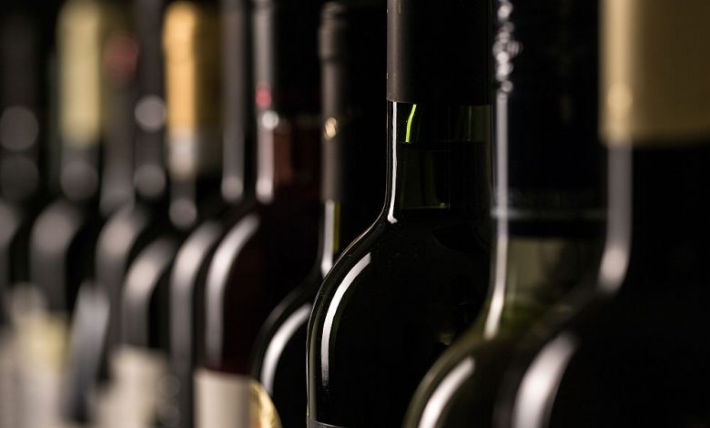
As a winemaker and business owner, you know that designing a label for your wine is a significant step in communicating the quality and character of your product. Not only does it help customers identify and choose your brand, but it also gives them an idea of what to expect when they open that bottle. A good label can attract attention on store shelves or in a restaurant, while a bad design will turn consumers away from buying your brand.
Research your audience
Now that you have a better idea of what your wine label should look like, it’s time to think about who will buy your product. Before you create anything, take some time to research your audience. This will help you understand their needs and interests, which can help guide the creation process.
Consider the bottle size, glass shape, and other design elements
Now you have a basic idea of what your wine will look like. Your next step is to consider the bottle size, glass shape, and other design elements.
Before you start designing a wine label, it’s important to consider how it will be used. You can make a decision based on how the customer will experience your wine:
If you’re planning to sell bottled wines in stores or restaurants, then having a label that wraps around the bottle may work best because it makes your brand stand out from other bottles on the shelf or table. Wrap-around labels enable customers to see both sides of them easily, even when they’re stacked face up, which maximizes visibility.
Include essentials
The essentials include the following;
Wine name: The name of the wine should always appear prominently on the label.
Wine type: If you can, include a few words describing the varietal or type of grape used in making your wine: “cabernet sauvignon,” “pinot noir,” etc.
Vintage year: This is helpful if you’re releasing multiple vintages of your wine and want to differentiate them on store shelves; it may be more important to note this information if you are making only one vintage at a time.
Alcohol content by volume: If your wines have varying levels of alcohol content, let people know by specifying how much they have per bottle or glass with an ABV percentage (alcohol percent by volume).
Total volume per bottle: If a particular style of wine is meant for sharing and not for individual servings, then knowing how many bottles are in each box will let buyers know whether or not they should buy two boxes instead of one.
Know your brand
You need to know your brand’s core values, target audience, mission statement, and story. This will help you define the style of artwork that fits your brand best. Knowing what makes your company unique helps narrow down the options for a label design as well.
Consider label material
You will also need to consider the material of the label. While paper and plastic labels have many benefits, each comes with its own set of pros and cons. Paper labels are inexpensive but may not hold up well in humid environments or direct sunlight. Plastic labels can be used outside and don’t curl if exposed to moisture.
However, they can be more expensive than paper labels and may become brittle over time. While these drawbacks may be a concern for some wineries, they won’t matter if you’re only printing out a few hundred bottles at home or planning on making only one batch at a time, in which case your only concern is price.
Look for inspiration from labels you admire
Look at other labels. You should consider the kind of bottle you’re designing for and what kinds of designs are out there. If you’re working with a standard size, you can look at different brands that use similar bottles and see what kinds of fonts and colors they use to enhance their labels. If you want something bolder, try looking at wines packaged in bigger bottles or ones with ornate shapes.
Take note of the typeface and font size used on other labels. Is it too large? Too small? Does it match your brand? Do the letters flow together well? Does it feel crowded on the label, or do they leave plenty of breathing room between words?
Explore color and font options
When choosing a color palette, it’s essential to consider how the colors will look on your label. For example, if you’re going for a purple background with silver text and gold accents, make sure those are the only three colors in use on your label. This creates an elegant effect that doesn’t overpower the rest of the design.
When choosing fonts for both text and logos or icons, think about how they’ll look printed on your labels as well as what message they’re conveying to consumers. Some fonts may be difficult to read or hard on the eyes. When people buy wine, they want their experience of drinking it to be pleasant.
Choose the standard size for your label
The standard label size is 3.5 inches by 5 inches (89 mm by 127 mm). This size will enable you to fit all the necessary information onto your label without making it too big for the bottle. With a bit of planning, you can create something that garners attention and conveys the essence of your wine.
It is crucial to get the basics right. For instance, use fonts that are legible, not decorative. Create an interesting shape for your label, such as a square or circle, rather than a rectangle. You can use photos or illustrations, or both, in your design. Ensure they are relevant to the story behind your wine. If possible, display any awards or other recognition you’ve received for your wine.
If you are looking for an excellent label design process, spend more time thinking about what you want to say visually about yourself and less time worrying about how good-looking it will look in print form.
Conclusion
As you can see, there are many factors to consider when designing a wine label. And while it may seem overwhelming at first, this list has some helpful tips for getting started on the right foot. Now it’s time for you to go out and make your own label.