
Creating a display stand requires you to think about several different components of the stand design. However, one thing that not enough people pay attention to is colour, which really does make a difference in marketing, according to colour psychology.
A display stand is a specific type of marketing that relies primarily on visual appeal. The more engaging your display stand is to the human eye, the more likely people are to take notice of it. Some of the most engaging colours for use on display stands include…
Red
Red is a bright colour that you instantly take notice of. It is the most visually powerful of the primary colours because it is such a warm, noticeable colour. Colour psychology has determined that red provokes the strongest emotional response of any of the colours, so it is a great choice for a display stand that you want people to engage with.
Yellow
It’s common to associate yellow with warnings, but there’s a reason that it’s used on signs, it catches the eye. Just like red, yellow is a reliable primary colour that comes in bright enough shades to be instantly noticeable. Incorporating yellow into your display stand will have passers-by pausing to see what you offer, which is your chance to engage with them.
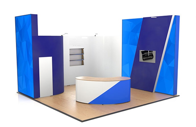
Blue
Shades of blue are considered to be more calming than alerting, but don’t let that put you off. Blue is a classic colour that won’t be too distracting due to its brightness. Using a variety of different blue tones can also add to the character of your display stand, making people more likely to engage with it. Its peaceful nature is also thought to stimulate productivity, so it’s perfect for a professional stand.
Green
Green is also commonly used on signs, so it is another colour that the eye naturally gravitates to. It isn’t quite as bright as red or yellow, so, like blue, it has the advantage of being easier to look at. Green means ‘go’, which might subconsciously help to direct people towards your stand, especially as the colour is thought to stimulate decisiveness in the brain.
Pink
Pink may not be a primary or secondary colour, but it is also an engaging choice for a display stand. It has the same eye-catching nature as red, but it is softer, so it’s perfect for a display that seeks to stimulate the eyes without seeming too overpowering. Whether light or bright in shade, pink has a variety of connotations, so it will entice passers-by to take a closer look.
Though there are other great choices too, those five are some of the best foundations for an amazing stand design. Colour is just one component of successful display marketing, but it’s an important one. Choosing the right colours for your stand will give you a visual advantage that allows you to engage with those that you hope to attract.